Color Drenching Kitchen: Cabinets, Walls and Trim in One Palette

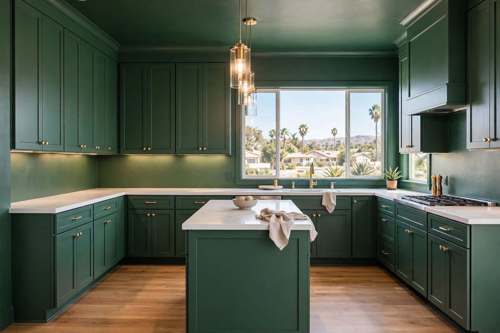
A color drenching kitchen carries one hue across nearly every painted surface in the room: cabinets, walls, trim, and often the ceiling. The look has moved from design magazines into real remodels across Chula Vista and the South Bay, and it reads as calm, deliberate, and finished.
Homeowners who see the style in person tend to ask the same question: how does a room painted a single color avoid feeling flat? The answer sits in the details. Undertones, sheen, natural materials, and light do the work that a second or third paint color would normally do.
Handled well, a color drenching kitchen can make a compact room feel settled and a large one feel pulled together. Handled casually, the same paint can swallow cabinet detail and turn a rich green or blue into a dark box.
What Color Drenching Means in a Working Kitchen
Color drenching means committing to one hue family for every painted element. Cabinet doors and drawer fronts take the color. Walls continue it. Baseboards, window trim, and interior doors join instead of defaulting to white, and many homeowners carry the same shade onto the ceiling to finish the envelope.
Two-tone cabinets split the color between uppers and lowers. An accent wall isolates it. A single bold cabinet color, set against neutral walls, makes the cabinets the event. Drenching removes the event and makes the whole room the statement.
Surfaces outside the paint plan still matter. Countertops, backsplash tile, flooring, and hardware sit inside the palette as materials rather than colors, and they carry most of the contrast.
Why One-Color Kitchens Fall Flat
Paint is only one layer of a room. A kitchen painted a single color, in a single finish, with the natural materials covered or removed, loses the shadow lines and texture shifts that tell your eye where one surface ends and the next begins. Cabinet doors merge into walls. Trim disappears. Deep colors absorb light and read heavier than they did on the swatch.
Most flat results trace back to a short list of mistakes:
- Painting cabinets, walls, and trim in the identical sheen
- Choosing the color from a small swatch under store lighting
- Painting over warm wood or stone that used to supply contrast
- Leaving the lighting plan unchanged after moving to a darker palette
- Testing the color on a wall but never on a cabinet door, where it reads differently
Each mistake has a direct fix, and the fixes stack. Undertone first, then sheen, then materials, then light.
Start With the Undertone, Not the Paint Name
Every paint color carries an undertone beneath the main hue. A green can lean yellow and feel warm, or lean blue-gray and feel cool. Two similar paint names can sit on opposite sides of that line, and the difference grows once the color covers four walls and a run of cabinets.
Undertones also explain why a color that looked right in a friend’s kitchen disappoints in yours. Flooring, countertops, and window direction shift what the undertone does. Deep shades show the effect clearly: the countertop and hardware pairings that succeed with moody blue kitchen cabinets depend on how the blue shifts — toward green, gray, or violet — once it is on the door.
Test the Color at Full Scale
Skip the small swatch card. Paint a large foam board and one spare cabinet door, then move both around the room across a full day. Morning light in many South Bay homes is cool and bright; late afternoon sun runs warm, especially through west-facing windows. A color that holds up at both ends of the day will hold up after the remodel.
Check the test pieces against the stone and wood already in the room, or against samples of the ones being installed. Gray-veined quartz next to a warm green can pull the green toward mud. White oak next to the same green can make it look richer. Catching that on a sample board costs an afternoon; catching it after cabinet finishing costs considerably more.
Let Sheen Do the Separating
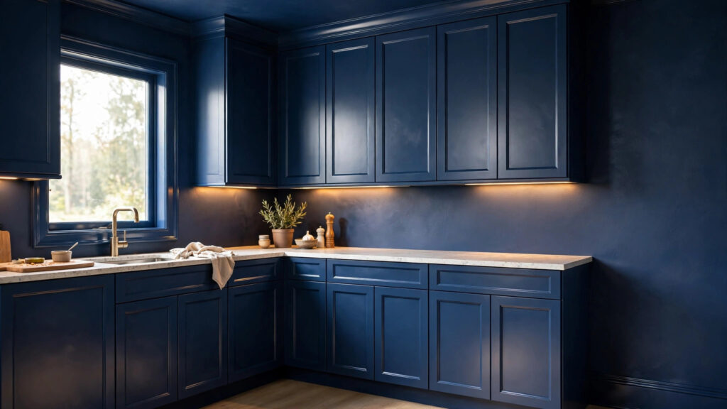
Sheen is the quiet engine of a color drenching kitchen. Same color, four finishes:
- Cabinets: satin or semi-gloss enamel, for durability and a soft reflection that outlines each door
- Walls: eggshell or matte, which absorbs light and recedes
- Trim: semi-gloss, one step above the walls, so baseboards and casings catch a highlight
- Ceiling: flat, which keeps the overhead plane calm and hides minor surface flaws
Light moves across those finishes at different intensities, and the eye reads the shifts as separation. Shaker panel shadows stay visible. Crown molding keeps its profile. The room stays one color without becoming one surface.
Durability argues for the same arrangement. Cabinet paint takes daily contact, cooking moisture, and cleaning, so it needs a harder enamel finish regardless of style. Walls in a matte or eggshell finish hide drywall texture better and touch up cleanly. Matching the sheen to the job each surface does gives the palette depth as a side benefit.
Stone, Wood, and Metal Supply the Contrast
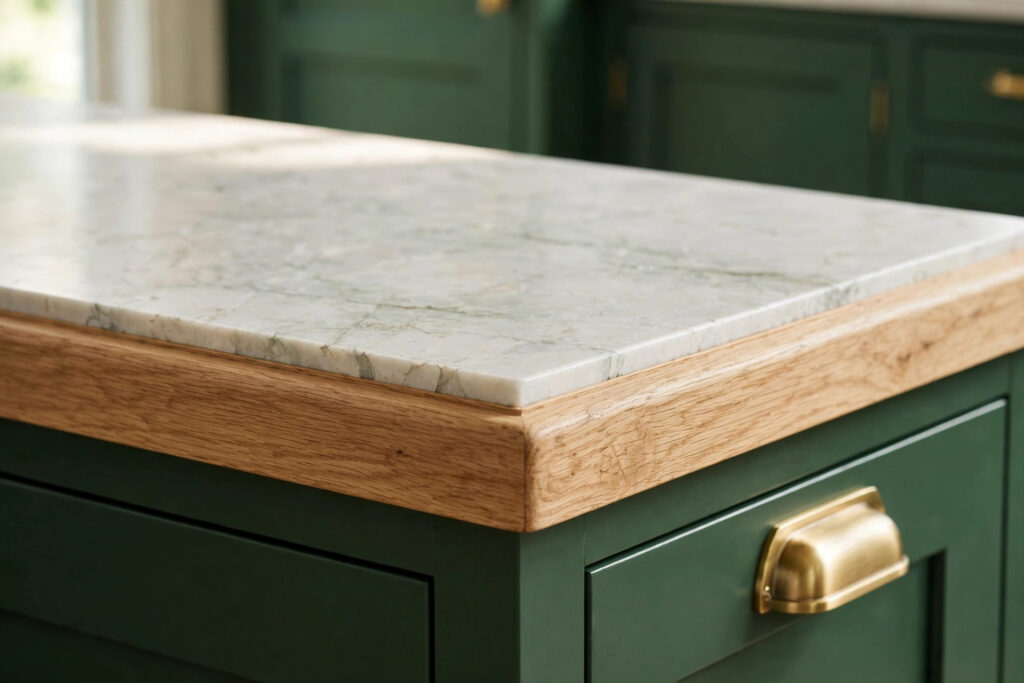
Contrast still has to come from somewhere, and in a drenched kitchen it comes from materials. Pale quartz or veined stone on the countertops lightens the field, gives the eye a resting place, and adds pattern without adding a second paint color.
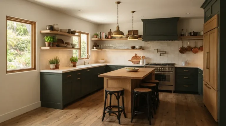
Wood plays the warming role. A white oak island, wood-look flooring, or a short run of open shelving breaks the painted surfaces with grain, and grain reads as texture rather than color competition. Warm wood against a cool green or blue keeps the room from feeling cold; dark walnut against a mid-tone palette adds weight at the base of the room.
Hardware and fixtures act as punctuation. Brushed brass warms a deep palette, matte black sharpens a light one, and polished nickel sits quietly in either direction. The metal footprint is small, so swapping hardware later is cheap if the room ever needs adjustment.
Lighting Decides How the Color Reads
Paint color is only half an input. The other half is the light hitting it. A sage or slate that looks soft under layered lighting can turn gray and flat under a single overhead fixture, and a deep aubergine-leaning shade can look nearly black in a north-facing room.
Plan lighting in layers for a drenched kitchen:
- Ceiling fixtures or recessed lights for general coverage
- Under-cabinet lighting to wash the backsplash and countertop
- Pendants or a fixture over the island for focused task light
- Bulbs in the 2700K–3000K range for warmth, matched across every fixture
Bulb temperature deserves attention because it shifts undertones. Cool bulbs push greens toward gray and blues toward icy. Warm bulbs push creams toward yellow. Consistency matters more than the exact number: mixed temperatures in one room make the same paint look like two colors.
Fitting Color Drenching Into a Remodel
Drenching touches nearly every trade already involved in a kitchen update: cabinet finishing, drywall and trim paint, stone, hardware, and lighting. On a full project, the palette gets settled during design, alongside layout and storage decisions, as part of an interior kitchen remodeling plan rather than a last-minute paint choice.
Sequencing protects the finish. Ceiling and walls get painted before cabinet doors come back from finishing, stone goes in after base cabinets are set and painted, and hardware goes on last, once every painted surface has cured. Homeowners painting cabinets themselves should expect a longer project than a standard repaint: doors and drawer fronts need full prep, color-matched primer, and cure time between coats.
One Palette, Several Layers
A color-drenched kitchen earns its depth in layers: the right undertone under the hue, a different sheen on each surface, stone and wood carrying the contrast, and lighting planned for the color instead of left over from the old one. Get those four decisions right and a single palette feels rich rather than flat, in a small Chula Vista galley or an open South Bay floor plan alike.
Start with samples, not commitments. Paint the board, paint the spare door, live with both for a few days, and let the room cast its vote before the first cabinet gets sanded.
Free Download: The Color Drenching Checklist
One page covering undertone testing, the sheen plan for each surface, material contrast, lighting layers, and the order to do the work in. Print it and check items off as your project moves.
Frequently Asked Questions
What does color drenching mean in a kitchen?
Color drenching means painting the cabinets, walls, trim, and often the ceiling in one hue. Depth comes from different sheens, natural materials, and lighting rather than from additional paint colors.
Does color drenching make a small kitchen look smaller?
Not when the palette and lighting are planned together. Mid-tone colors with satin cabinet finishes and layered lighting can make a small kitchen feel settled and cohesive instead of chopped up.
Which paint sheen works best on cabinets in a color-drenched kitchen?
Satin or semi-gloss enamel holds up best on cabinets because it resists moisture, grease, and frequent cleaning. The slight reflection also separates the doors visually from matte or eggshell walls in the same color.
Should the ceiling match the cabinets and walls?
Matching the ceiling completes the effect and works well in a flat finish, which hides surface flaws. Leaving the ceiling a soft white is a reasonable middle step in rooms with low ceilings or limited natural light.
Can color drenching work with light colors?
Yes. Cream, soft white, and pale greige palettes can be drenched the same way as deep colors, and the technique keeps an all-light kitchen from looking unfinished. Undertone control matters even more at the light end, since warm and cool whites clash quickly.
Planning Your Kitchen Remodeling Project?
Vexkitch Kitchen Remodeling has been remodeling kitchens in Chula Vista and the surrounding South Bay communities since 2017, with more than 700 completed projects. Our team settles palette, materials, and lighting during design, so decisions like a color-drenched finish get tested against your actual room before work begins.
Explore our complete kitchen remodeling services in Chula Vista and schedule a consultation to talk through your project.