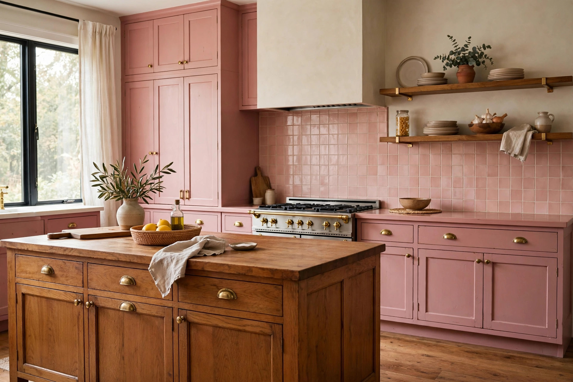
Vintage Pink Kitchen: Cabinets, Tile and Warm Wood Pairings

Some colors date a kitchen fast. Vintage pink does the opposite when it is handled well. Dusty rose and blush tones rooted in mid-century design read as calm and collected, not sweet. The catch is that pink reacts to everything around it. Lighting, wood tone, and tile decide whether the room feels like a heritage kitchen or a theme.
Across Chula Vista and the South Bay, a vintage pink kitchen fits the architecture of many mid-century and ranch homes. Rose-toned cabinets and retro tile can honor that era without locking the house into the 1950s. The difference comes down to choosing cabinets, tile, and wood as one palette instead of three separate decisions.
This breakdown covers how to pick the right pink tone for cabinets, pair it with retro tile and warm wood, and finish the space with hardware and lighting that keep the look grounded — so the kitchen reads as an intentional design choice.
Why Vintage Pink Needs a Clear Plan Before Anything Gets Ordered
Pink is a reactive color. It picks up the undertones of whatever sits next to it, which means a pretty paint swatch can turn muddy against the wrong tile or icy against the wrong flooring. Homeowners usually run into trouble when they fall in love with one element — a pink cabinet door, a retro tile — and build the rest of the room around it later, after finishes are ordered.
The fix is to define the full palette on paper first: one lead pink tone, one tile, one wood tone, and one metal finish. Every selection gets checked against the other three, which keeps the room from drifting into a mix of pinks that were never meant to meet.
Vintage pink also deserves a clear identity of its own. It sits far from the saturated color statements some homeowners consider. For contrast, aubergine kitchen cabinets take a dark, dramatic route, while vintage pink stays soft, light, and rooted in retro warmth. Knowing which lane you are in makes every later choice easier.
Choosing the Right Pink Tone for Cabinets
Paint swatches lie under showroom lighting. A dusty rose that looks muted in the store can glow peachy in a south-facing Chula Vista kitchen by 3 p.m. The three tones that work best for a vintage look each behave differently once they are on full cabinet runs.
Dusty rose carries a gray-beige undertone and forgives a lot of mistakes. It stays composed next to wood and reads as a neutral with warmth rather than a statement color. Blush leans warmer with a soft peach undertone, and it pairs best with honey-toned woods that echo its warmth. Vintage enamel pink is the palest of the three — the shade of mid-century appliances — and it works when the goal is a whisper of color rather than a feature.
Undertones matter more than the color name on the can. Compare the cabinet tone against the tile sample under your own kitchen lighting, morning and evening, before committing. A rose with a blue undertone next to a tile with a peach undertone will fight all day, and no hardware choice can hide that.
Sheen plays a role too. Satin finishes reflect enough light to keep pink from looking flat, and they wipe down well around cooking zones. Flat matte finishes show every fingerprint and grease mark, which becomes a daily annoyance in a working kitchen.
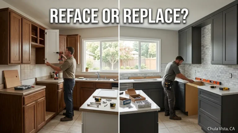
Cabinet construction decides how good the paint job looks in person. Factory-applied finishes on custom cabinetry and countertops cure harder and lay flatter than most field-painted surfaces, and that matters with a color that shows every brush mark. Refinishing works when the boxes are solid; replacement is the honest answer when they are failing.
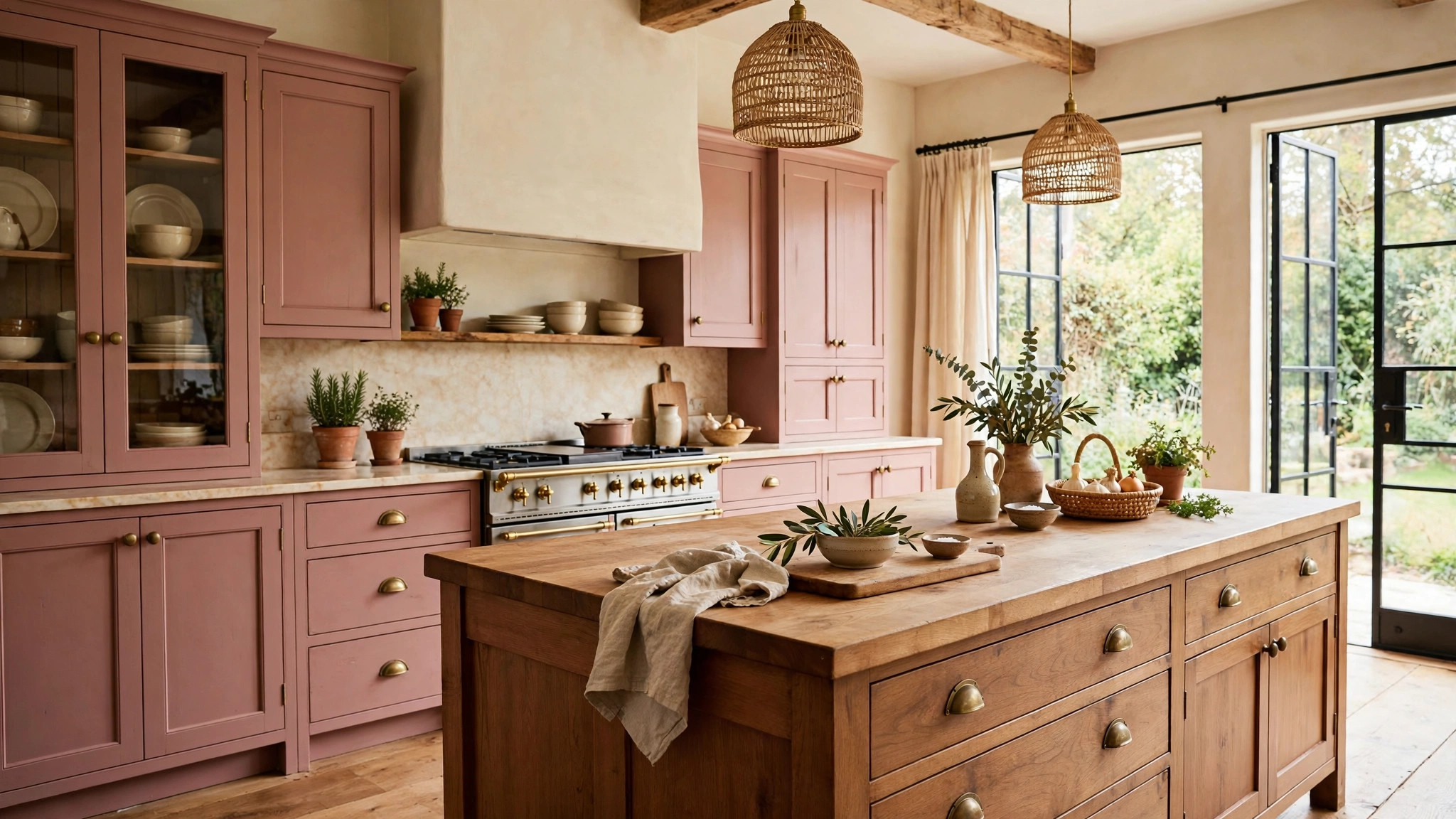
Pairing Retro Tile With Vintage Pink Cabinets
Tile is where vintage pink kitchens most often go wrong. The instinct is to match pink to pink, but two pinks from different dye lots rarely harmonize. Cabinets and tile in slightly different pinks read as a mistake, not a scheme.
A better approach is to let the tile support the pink instead of copying it. Glossy blush square tile in a handmade style, with soft variation from tile to tile, gives the retro read without demanding an exact match. The variation is a feature: it echoes how vintage tile actually looked.
Grout choice shapes the final effect more than homeowners expect. Warm white grout keeps the tile field soft and cohesive. Bright white grout creates a hard grid that competes with the cabinets. Gray grout drags a blush tile toward muddy. Keep the grout one step warmer than the tile and the whole wall reads as one surface.
Tile layout can also carry the vintage reference. Straight-stacked square tile nods to mid-century bathrooms and kitchens without looking like a reproduction. Running the backsplash to the ceiling behind open shelving or the range gives small kitchens a taller feel and lets the tile do more of the decorative work.
For installation, tile work rewards experienced hands, especially with handmade-look tile where spacing and grout lines need judgment. Our kitchen backsplash and flooring services cover both backsplash tile and the flooring underneath, so the two surfaces get planned as one detail instead of two separate jobs.
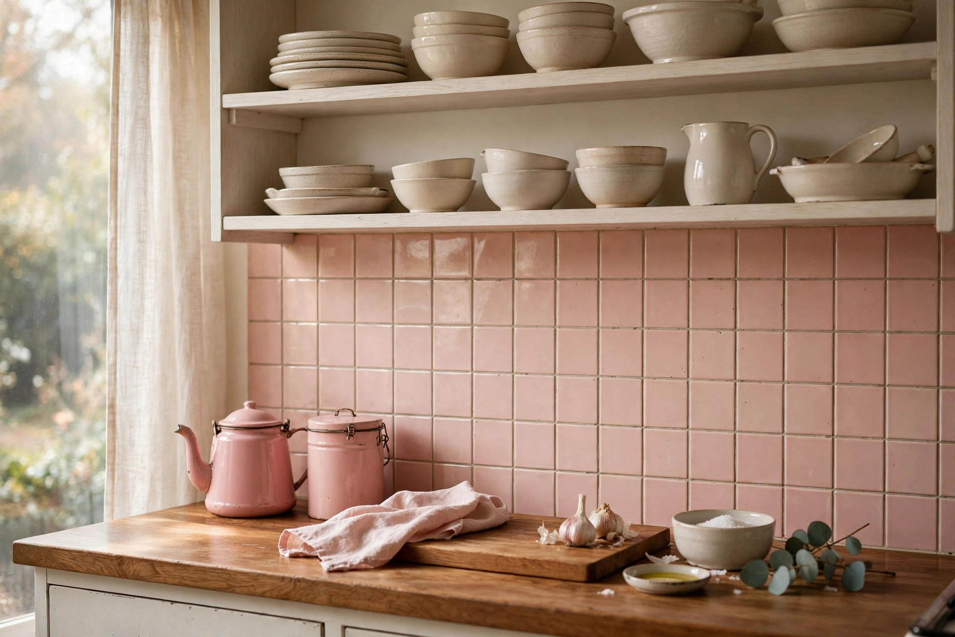
Warm Wood Pairings That Keep Pink Grounded
Pink without wood can slide into territory that feels either sugary or flat. White alongside pink reads sweet. Cool gray alongside pink reads dull. Warm wood is what anchors a vintage pink kitchen and gives it the “kitchen” feeling — natural, lived-in, and a little bit rustic.
White oak is the workhorse pairing. Its pale, neutral-warm tone sits comfortably next to dusty rose without adding more color to manage. It works for floors, floating shelves, and range hoods, and it keeps the room bright. Walnut brings more contrast and suits homeowners who want the pink to feel deliberate rather than delicate. A walnut island against rose perimeter cabinets is one of the strongest combinations in this palette.
Butcher-block countertops deserve a mention because they solve two problems at once. They add the warm wood tone at eye level, right where it balances the cabinets, and they cost less than stone while aging with a patina that suits the vintage theme. A wood island top over painted base cabinets is a pairing that has looked right for decades.
Keep to one dominant wood plus one accent at most. White oak floors with a walnut island works. Oak floors, oak shelves, oak island, and a walnut table does not — the room starts to feel like a wood sample board. Let the wood recede so the pink stays the lead.
Many South Bay ranch homes already have wood floors with good bones. Sanding and refinishing them in a warm tone often beats replacement and keeps the budget focused on cabinets and tile, where the pink story is told. Our notes on warm wood kitchen ideas cover more of these material combinations for Chula Vista homes.
Hardware, Lighting, and the Details That Sell the Look
Hardware is small, but it is the detail visitors actually touch. Polished chrome or polished nickel next to pink can look cold and commercial, which fights the vintage warmth the rest of the room is building. Aged brass is the natural partner: its warm patina sits inside the same color family as the wood and the pink. Unlacquered brass develops character over time; brushed or satin brass gives most of the warmth with a stable, lower-maintenance finish. Cup pulls on drawers and knobs on doors reads period-appropriate without feeling like a costume.
Lighting temperature deserves the same attention as paint undertones. Cool daylight bulbs (4000K and up) pull pink toward gray and make wood look washed out. Warm bulbs in the 2700–3000K range keep the pink rosy and the wood honeyed. Under-cabinet lighting in that warm range also makes the backsplash tile glow in the evening, which is when the kitchen gets used most.
Open shelving, if you include it, should be styled lightly. A few stacks of cream or white dishes against white oak shelves reinforce the palette. Cramming shelves with colorful items turns the vintage reference into clutter. One or two vintage pieces — an enamel pitcher, a ceramic canister — make the point better than a full collection.
Remodeling Logistics: Sequencing a Vintage Pink Kitchen in Chula Vista
A pink kitchen punishes poor sequencing more than a white one does. Paint colors get approved against tile samples, so the tile decision has to come before the final cabinet color sign-off. Flooring goes in before cabinets. Backsplash tile goes in after countertops. Hardware is last, since drilling pulls and knobs into freshly finished doors is a one-shot operation.
Budget follows the same logic. Refinishing existing cabinets in a dusty rose costs a fraction of full replacement, and it is a fair choice when the boxes are sound and the layout works. Full replacement makes sense when storage, layout, or cabinet condition is the real problem — painting over failing boxes wastes the finish investment.
Many Chula Vista homes from the mid-century era have plaster walls and older electrical, so a remodel that opens walls for tile or lighting changes sometimes uncovers work that needs handling first. A structured plan accounts for that before finishes are ordered. Our kitchen remodeling services in Chula Vista follow a defined process from consultation through final walkthrough, which keeps finish decisions like pink tones and tile pairings in the right order.
Free Download: Vintage Pink Pairing Checklist
Choosing a vintage pink palette involves five decisions that all affect each other: the pink tone, the cabinet finish, the tile pairing, the wood tone, and the hardware. We put the guidance from this article into a one-page checklist you can print and bring to showroom visits or contractor meetings.
Download the Vintage Pink Pairing Checklist (PDF)
Frequently Asked Questions
Will a vintage pink kitchen look dated in a few years?
Soft retro pinks like dusty rose and blush have cycled through kitchen design for decades without disappearing, unlike brighter trend colors. Paired with warm wood and classic tile, the look reads as timeless rather than trendy.
What countertop colors work with dusty rose cabinets?
Butcher block and warm wood tops are the most natural fit. For stone, look at warm whites, light creams, and soft beiges with warm veining, and avoid cool grays that pull pink toward muddy.
Is pink tile hard to keep clean?
Glossy ceramic tile wipes down as easily as any other glazed tile. The main maintenance point is grout: a quality grout sealer and warm white grout keep a blush backsplash looking fresh in a working kitchen.
Can I get the vintage pink look without replacing my cabinets?
Yes, if the cabinet boxes are structurally sound and the layout works. Professional refinishing in a dusty rose or blush tone, paired with new hardware and a retro tile backsplash, delivers most of the look at a fraction of replacement cost.
Does a pink kitchen hurt resale value in Chula Vista?
Bold custom colors can narrow buyer appeal, but soft vintage pinks in the dusty rose and blush range tend to photograph warmly and suit the mid-century housing stock common in Chula Vista and the South Bay. Keeping the pink to cabinets and tile while leaving floors and counters neutral protects resale flexibility.
Planning Your Vintage Pink Kitchen Remodel?
A vintage pink kitchen rewards careful pairing of cabinets, tile, wood, and hardware. Vexkitch Kitchen Remodeling has completed more than 700 kitchen projects across Chula Vista and the South Bay since 2017, and we plan color-driven remodels with the same structured process we bring to every job.
Reach out through our kitchen remodeling services in Chula Vista to start the conversation, or send us a message on the contact page to schedule a consultation.