Colorful Kitchen Ideas: Retro Colors, Appliances & Bold Accents

White cabinets have had a long run in Chula Vista kitchens. They photograph well, but plenty of homeowners quietly admit the finished result feels flat once the boxes are unpacked and daily life moves in. That flatness is driving renewed interest in colorful kitchen ideas — and this wave is sharper than the dated Tuscan reds and hunter greens of the early 2000s.
The new take on colorful kitchens leans on 50s retro palettes, enameled appliances, and disciplined placement. Color lands in specific spots instead of bleeding across every surface. Below is where bold color belongs, how to choose a retro palette that still looks right in five years, and the placement framework our designers use on multi-color projects across South Bay.
Why Colorful Kitchens Are Coming Back
The shift started with renovation fatigue. Block after block of near-identical white-and-gray kitchens made bold color feel fresh again, and search data on Pinterest backs it up — “retro kitchen” and “colorful kitchen” saves keep climbing year over year. Homeowners don’t just want color, though; they want personality with a plan.
The 50s kitchen look works because it’s familiar. Mint, butter yellow, cherry red, and teal read as cheerful rather than aggressive, which makes them easier to live with than trend-driven brights. Chrome trim, diner-style curves, and checkerboard floors give the palette structure so the color feels designed rather than random.
There’s also an important split in how people use color today. Some kitchens go single-hue — every surface in one saturated shade. Others, which is what this post covers, mix two or three retro colors with neutrals. Both approaches work, but they follow different rules. If the one-color look appeals to you, our color drenching kitchen guide walks through that technique in detail.
Where to Put Bold Color: The 3-Zone Rule
The most common failure in a colorful kitchen isn’t the color itself — it’s placement. Red cabinets, a red range, a red backsplash, and red barstools in one room read as chaos, not design. The fix is a simple framework we call the 3-zone rule.
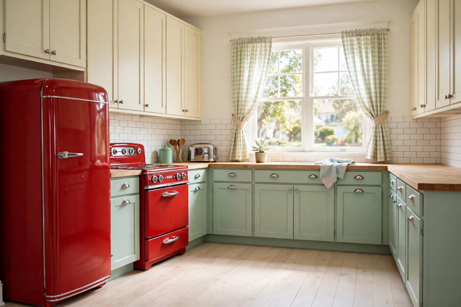
Zone 1 — The shell. Perimeter cabinets or the island. This is where the largest field of color lives, and it’s the decision that sets everything else. Painting the island in a deep teal while the perimeter stays cream gives you presence without commitment.
Zone 2 — The appliances. A range or refrigerator in a retro color acts as a second anchor. One hero appliance is enough; two can work if the hues match exactly.
Zone 3 — The accents. Backsplash tile, floor pattern, barstools, lighting, and open-shelf styling. This zone is the easiest to change later, which makes it the safest place to experiment.
The working rule: commit to two zones, keep the third mostly neutral. Carrying strong color through all three zones is possible, but it demands matched undertones and professional discipline — exactly the kind of planning our complete kitchen remodeling services in Chula Vista include at the design stage.
Retro Colors Done Right: 50s Palette Rules
A genuine 50s kitchen palette is narrow: mint green, butter yellow, cherry red, teal or aqua, and cream. These shades were engineered to sit together — they share a similar value range, which is why a mint kitchen with a cherry red range doesn’t clash the way random brights do.
Three rules keep the palette honest:
- One dominant, one support, one neutral. Mint cabinets with cherry red appliances and cream walls is a complete recipe. Adding butter yellow barstools counts as the support color; adding a teal backsplash on top of that tips the room toward chaos.
- Keep undertones consistent. A warm butter yellow pairs with cherry red and cream. A cool mint pairs with aqua and chrome. Mixing warm and cool versions of retro colors is what makes a kitchen feel “off” without an obvious cause.
- Sample in your actual light. South Bay kitchens get strong afternoon sun from the west, and mint can read gray in morning light and green at noon. Paint large boards, move them around the room, and look at them morning and evening before committing.
Vintage kitchen decor finishes the look: chrome pendant lights, a glass-front hutch, jadeite dishware on open shelves, or a small checkerboard tile inlay at the entry. These touches cost little and signal the era more clearly than paint alone. When cabinets need refinishing rather than replacement, professional kitchen cabinet painting delivers the smooth, durable finish that retro colors demand.
Colored Kitchen Appliances: What to Know Before You Buy
A retro-colored range or refrigerator is often the single most impactful move in a colorful kitchen. It brings the era’s personality without a drop of paint. Before ordering, though, know how these appliances differ from standard stainless.
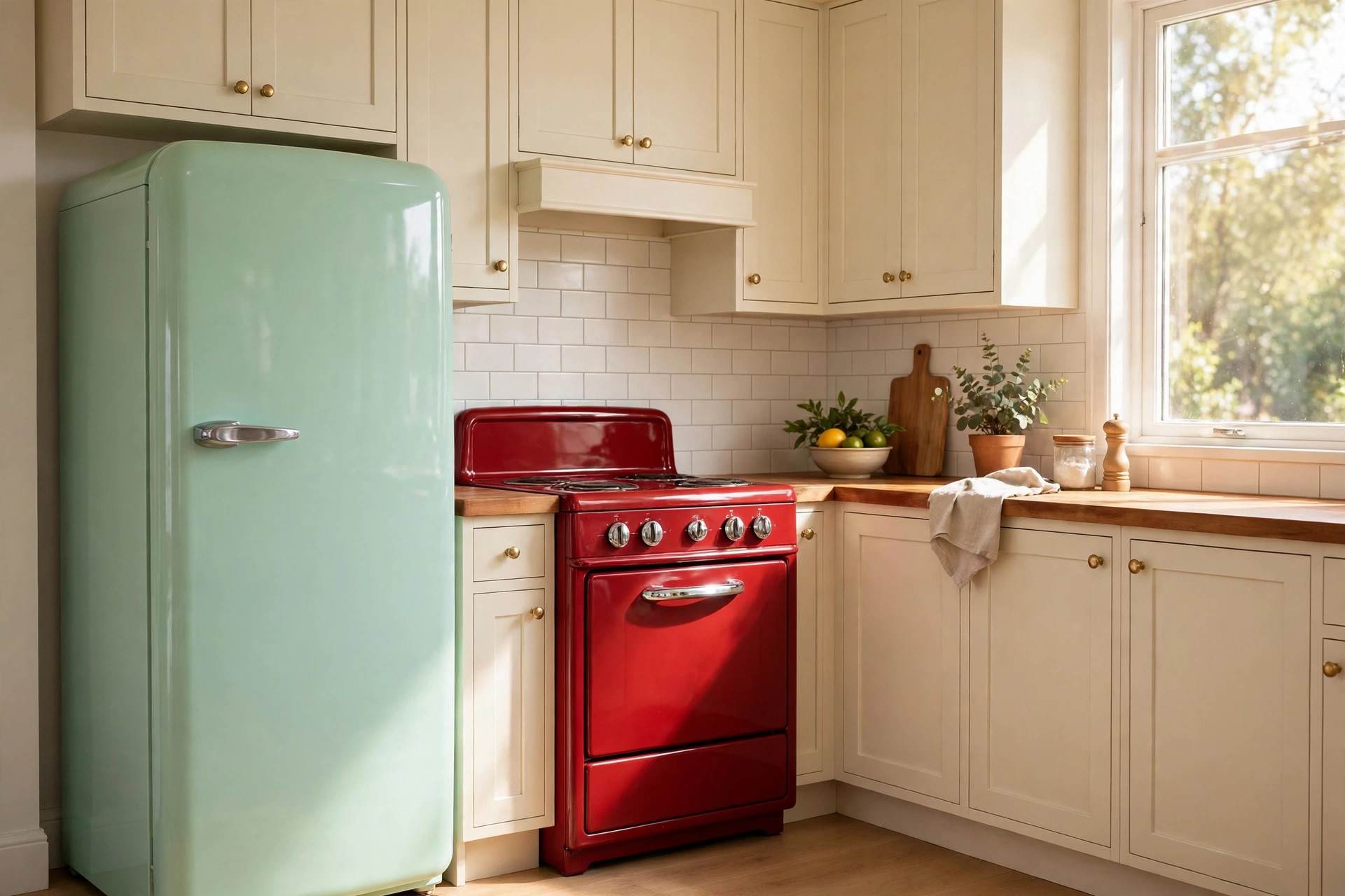
Cost. Colored and retro-style appliances typically run 15–40% above comparable stainless models. Specialty brands like Big Chill, Northstar, and Smeg price at the premium end; mainstream brands now offer limited retro colors at a smaller markup. Budget the difference early rather than discovering it at selection time.
Lead times. This is the detail that derails schedules. Retro and custom-color appliances frequently ship in 8–16 weeks, versus days for stock stainless. Order them during design — not during construction — or the whole project waits on a refrigerator.
Coordination. Choose the appliance color before finalizing cabinet paint, not after. Paint can be matched to anything; an enameled range in a fixed cherry red cannot. Bring a physical sample of the appliance color to every material meeting.
The one-hero rule. A mint refrigerator with a standard stainless range looks intentional. A mint refrigerator, a red range, and a yellow dishwasher look like a showroom exploded. If you want two colored appliances, they should be the same color, from lines designed to coordinate.
Kitchens With Red Countertops: Making a Statement Surface Work
Few choices commit to color like red countertops. Kitchens with red countertops sit firmly in 50s diner territory, and they can be spectacular — provided the rest of the room stays quiet. Cream or white cabinets, chrome hardware, and a simple white subway backsplash let the surface be the star.
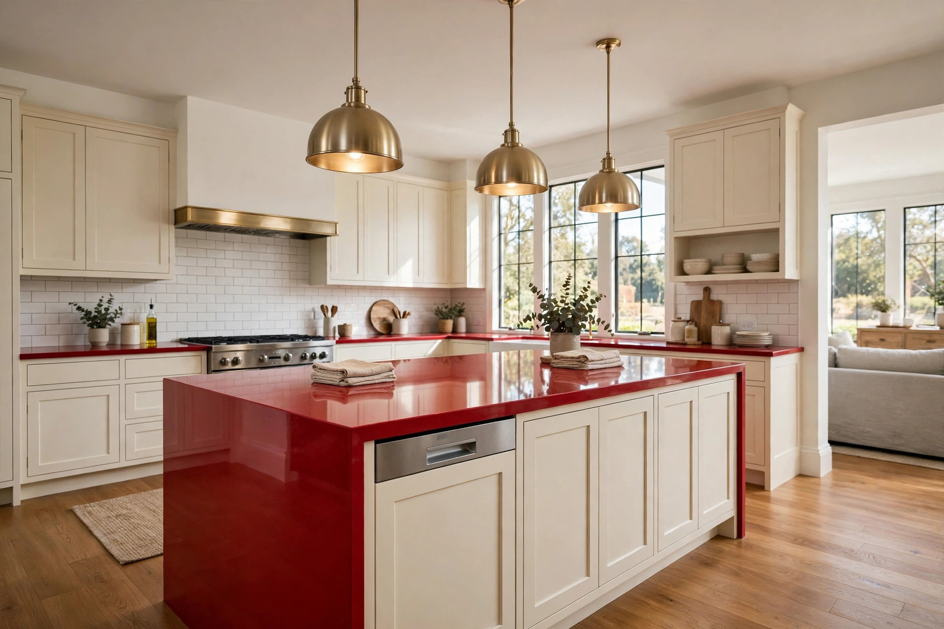
Material options span budgets. Red laminate is the affordable classic and the most authentic to the era. Red quartz gives a more polished, durable surface with consistent color. Tinted concrete works in custom builds but needs sealing and maintenance most homeowners underestimate.
Finish matters as much as material. Glossy red reads retro-diner; matte or honed red reads more contemporary. Gloss shows fingerprints and smudges more readily, so households with young kids often prefer a matte finish. Under-cabinet lighting also deserves attention — warm lighting keeps red rich, while cool daylight bulbs can push it toward pink.
One firm rule: never pair red countertops with red or burgundy cabinetry. The surfaces blend into each other and the room loses all definition. Red needs a neutral partner to read as a choice rather than an accident.
Color Drenching Tie-In: When One Color Takes the Whole Room
Everything above describes a multi-color approach: two or three retro hues balanced with neutrals. Color drenching is the opposite move — one saturated shade carried across cabinets, walls, trim, and sometimes the ceiling for a fully immersive room.
Drenching suits small galley kitchens especially well, where a single teal or deep green can make the space feel intentional rather than cramped. It also demands precision: one sheen across surfaces, careful lighting, and a color with enough depth to avoid looking flat. Our full color drenching kitchen guide covers the technique step by step, including which colors drench well and which ones don’t.
If pink is the color pulling you in, note that it’s a different project from what’s described here. Our Vintage Pink Kitchen post covers a single-hue pink scheme in depth — the framework in this guide is built for multi-color retro looks instead.
Mistakes That Make a Colorful Kitchen Feel Chaotic
Bold color forgives less than white does. These are the errors we see most often in South Bay kitchens, and every one is preventable with planning:
- Too many hues. Four or five strong colors compete instead of harmonize. Hold the line at two or three.
- No neutral breathing room. Cream walls, a white ceiling, or a light floor give the eye somewhere to rest. Without a neutral, the room feels loud instead of lively.
- Clashing undertones. A warm cherry red next to a cool blue-gray cabinet reads wrong even when both colors are attractive alone. Check undertones on large samples, side by side.
- Painting before choosing appliances. Fixed-color appliances can’t adapt to your paint; paint can adapt to anything. Sequence the decisions correctly.
- Skipping the light test. Retro pastels shift dramatically under warm versus cool bulbs. Test every color under the lighting you’ll actually install.
- Forgetting the long view. A checkerboard floor and mint cabinets have looked right for seventy years. A neon accent wall has not. When in doubt, anchor the permanent elements in proven retro shades and put trends in the easy-to-change zone.
A colorful kitchen rewards confidence and punishes impulse. Plan the palette on paper, sample every color in the room, and let each bold choice earn its place.
Free Download: Colorful Kitchen Planning Checklist
Want the placement rules and palette checks from this post in a one-page reference? Download our free Colorful Kitchen Planning Checklist — the 3-zone placement framework, the 50s palette rules, appliance lead-time reminders, and the chaos-avoidance checklist, all on one printable page from Vexkitch Kitchen Remodeling.
Download the Colorful Kitchen Planning Checklist
Frequently Asked Questions
Will colorful cabinets hurt resale value in Chula Vista?
Well-executed color rarely hurts resale, and a tasteful retro palette can help a listing stand out. Keep the cabinetry quality high and the palette classic — mint, teal, and navy have broad appeal. If you’re concerned, put the bold color on the island only and keep perimeter cabinets neutral.
How do I pick a retro color palette?
Start with one dominant color, add one supporting color, and anchor both with cream or white. Keep undertones consistent — warm with warm, cool with cool — and test large painted samples in your kitchen’s actual light before committing.
Are red countertops dated?
Red countertops read retro rather than dated when they’re paired correctly: cream cabinets, chrome hardware, and a simple backsplash. The dated look comes from pairing red with other reds or with busy granite patterns, not from the color itself.
Can I add color without painting cabinets?
Yes. A retro-colored range or refrigerator, a bold backsplash, painted barstools, colorful pendant lights, and styled open shelving all add strong color while cabinets stay neutral. These moves cost less and reverse easily if tastes change.
How much more do colored kitchen appliances cost?
Expect to pay roughly 15–40% more than comparable stainless models, with specialty retro brands at the higher end. Lead times of 8–16 weeks are common, so order colored appliances during the design phase to avoid delaying construction.
What’s the difference between a colorful kitchen and color drenching?
A colorful kitchen mixes two or three hues with neutrals, following placement rules like the 3-zone framework. Color drenching carries one saturated shade across nearly every surface for a fully immersive single-color room.
Ready to Bring Color to Your Chula Vista Kitchen?
A colorful kitchen works when the palette is planned and the placement is deliberate. Vexkitch Kitchen Remodeling has completed 700+ kitchen projects across Chula Vista and South Bay since 2017, and bold retro designs are some of our favorite work. Reach out through our contact page to talk through your ideas, or explore our complete kitchen remodeling services in Chula Vista to see how a project comes together.