
Two-Tone Kitchen Cabinets: Color Pairings That Work

A single cabinet color across an entire kitchen can feel flat, especially in the open layouts common in Chula Vista homes. Two-tone kitchen cabinets fix that with a simple idea: one color carries the main run of cabinets, and a second marks a smaller, clearly defined area. Done well, the pairing adds depth and a focal point; done carelessly, the kitchen reads as unfinished.
The kitchens that pull it off share the same habits: the split follows the room’s structure, the two colors differ enough to look deliberate, and hardware, countertops, and backsplash tie the pair together. Homeowners across Chula Vista and the South Bay ask about two-tone cabinets for ranch kitchens, townhouse galleys, and open-plan remodels, and these formulas hold up across all three.
What follows covers the two main placement formulas, anchor and accent selection, the finish rules that keep a pairing looking planned, contrast guidance, and the rooms where a single color serves the house better.

The Island-vs-Perimeter Formula
The most reliable two-tone split puts the accent color on the island and the anchor color on the perimeter cabinets. The island already reads as a separate piece of furniture, so a different color looks intentional rather than random, and it keeps the bold color contained — the island usually accounts for 20 to 30 percent of the cabinetry, leaving the quieter color in charge of the room.
Start with the perimeter color, since it covers the most surface: warm white, soft greige, and light gray are the usual anchors because they recede and let the island carry the personality, while the island color can go bolder — deep navy, forest green, charcoal, or a stained wood tone.
A few details make this formula work:
- Keep the island color darker than the perimeter color in most rooms — a dark island grounds the space and reads as a deliberate centerpiece. A light island with dark perimeter cabinets can work in a bright room with large windows, but the effect flips easily into a top-heavy look.
- Size matters: an island shorter than about five feet struggles to carry a bold color — the accent reads as a patch instead of a statement. In a compact kitchen, keep a short island the same color as the perimeter and move the accent to a tall pantry cabinet or a hutch-style run.
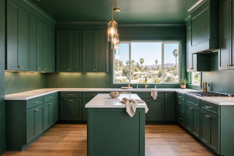
White or greige perimeters with navy or deep green islands are common in Chula Vista kitchens, and the combination holds up in the bright, warm daylight South Bay homes get — strong light washes out timid colors, so the island color needs depth to stay visible at midday.

Upper vs. Lower: The Second Classic Split
The second formula splits cabinets horizontally: light uppers, darker lowers. Light uppers keep the wall plane bright and open, while darker lowers ground the room and hide the scuffs and fingerprints daily use leaves at knee height. The split suits galley kitchens and smaller rooms well, since the eye reads the light uppers first and the room feels taller.
The proportions matter: uppers usually account for 35 to 45 percent of the cabinet area, so the darker lower color still dominates — that is the point. The darker color anchors the room, and the lighter color lifts it.
Reversing the split — dark uppers, light lowers — is harder to pull off: dark wall cabinets press the ceiling down visually, worse in rooms with standard eight-foot ceilings or limited natural light. The reversal can work in a tall kitchen with large windows, but it is the exception rather than the rule.

Picking the Anchor Color and the Accent Color
Every two-tone kitchen has two jobs for color: one holds the room together, the other gives it character. The anchor color does the first job — it covers the majority of the cabinets, so it should be the quieter, more neutral choice: a warm white, a soft greige, a pale gray, or a light wood tone. The accent color does the second, covering the smaller area and carrying the personality: navy, deep green, charcoal, black, or a rich stain.
Choose the anchor first — a common mistake is falling for a bold color and then hunting for something to pair with it. Start with the neutral that suits the room’s light and existing finishes, then pick the accent against it.
Undertones decide if the pair looks planned or accidental. Warm whites with yellow undertones sit comfortably beside white oak or walnut; cool grays with blue undertones sit beside navy or slate. A warm anchor with a cool accent can work — white oak and navy is a proven combination — but the pair needs a shared element, usually the countertop or hardware finish, to bridge the gap.
Test both colors in the room before committing: paint large sample boards and move them around the kitchen through the day — South Bay daylight runs bright and warm, and colors read lighter here than on a swatch under store lighting. A navy that looks rich in the shop can wash out to a flat blue-gray by the window at noon, so live with the samples before ordering.
Finish Pairing Rules That Keep Two Tones Looking Planned
Color is only half the pairing. The finishes on each cabinet color decide if the two tones look like a design choice or a leftover mix.
Painted plus wood. A painted anchor with a wood accent is the most forgiving combination: warm white or soft greige perimeter cabinets pair naturally with a white oak or walnut island, because the wood grain adds texture the paint cannot. Keep the wood tone consistent — one stain, used once, reads as deliberate, while two different wood tones plus a paint color is one material too many.
For a closer look at how warm wood and a dark tone balance each other, see our white oak and black kitchen breakdown.
Matte plus sheen. Pair a matte or satin cabinet finish with a surface that reflects a little light — a satin or gloss backsplash, a polished countertop, or glass-front uppers. The contrast in sheen gives the room depth without adding another color, and matte finishes hide fingerprints better on lowers. Avoid two high-gloss surfaces facing each other; the reflections compete.
Warm plus cool. One warm element and one cool element balance each other: warm wood with cool navy, warm greige with cool sage green, warm brass hardware with a cool gray cabinet. Two cool tones can feel sterile and two warm tones muddy, unless a neutral countertop or backsplash breaks the run.
Same door style, both colors. The cabinet door profile should match across both colors: a Shaker door in white and a Shaker door in navy reads as one kitchen with two colors, while a Shaker door in white and a flat-panel door in navy reads as two kitchens sharing a room. When the goal is a two-tone look rather than a full replacement, our cabinet refacing vs. replacing guide explains how new doors and finishes can deliver the pairing without removing the cabinet boxes.
Getting the Contrast Ratio Right
Two-tone cabinets need enough contrast to read as a choice: two colors close in value — a pale gray beside a slightly darker pale gray — look like an ordering mistake rather than a design decision. The pair should differ clearly in lightness or hue, ideally both.
A practical guide is the 70/30 split: the anchor covers roughly 70 percent of the cabinetry, the accent about 30 percent. The exact split matters less than the hierarchy — one color leads, the other supports. A 50/50 split leaves the eye unsure which color defines the room.
A quick test helps before ordering: photograph the two sample boards together and convert the photo to black and white. If the two tones still read as clearly different, the contrast holds; if they blur into one gray, the accent needs more depth.
High contrast pairs — black and white, charcoal and cream — need a calm room around them: a quiet backsplash, a neutral countertop, consistent hardware. The bolder the cabinet contrast, the simpler everything else should be.
Coordinating Hardware, Countertops, and Backsplash
Hardware, countertops, and backsplash are the pieces that make two cabinet colors feel like one kitchen.
Hardware. Use one hardware finish across both cabinet colors — brass pulls on the navy island and brass pulls on the white perimeter read as a single decision, while mixing brass on one color and matte black on the other splits the room a second time. The finish should suit both colors: warm brass flatters navy, green, and wood; matte black sharpens white, gray, and greige; brushed nickel stays neutral across nearly any pair.
Countertops. One countertop material across both cabinet zones keeps the pairing grounded: a light quartz or marble-look surface works across white perimeters and dark islands alike and gives the eye a continuous plane. An island countertop in a different material can work — butcher block on the island, quartz on the perimeter — as long as the tones stay in the same family.
Backsplash. The backsplash should contain or complement both cabinet colors — a white or soft neutral tile with a hint of the accent color in its veining or glaze ties the pair together quietly. A busy patterned tile plus two cabinet colors is usually one pattern too many, and when the pairing is bold, the backsplash should be the calmest surface.
When Two-Tone Cabinets Do NOT Work
Two-tone cabinets suit many kitchens, but not every room benefits.
Very small kitchens. In a galley or condo kitchen under roughly 100 square feet, two colors chop the room into visual pieces and make it feel smaller, while a single light color keeps sightlines clean. Homeowners who still want the look can limit the accent to one tall pantry cabinet or a hutch-style run.
Already-busy layouts. A patterned backsplash, a bold veined countertop, open shelving, and two cabinet colors add up to visual noise. When the room already has two strong surfaces, the cabinets should stay quiet — drop one competing element before adding a second color.
Clashing undertones. Warm cream uppers with a pink undertone beside cool gray-blue lowers can look dirty rather than layered — undertone clashes are the most common reason a pairing feels wrong even when the colors look fine on paper. Sample boards in the room catch this before the cabinets are ordered.
Rooms with competing wood tones. A kitchen that already has warm wood flooring, a wood range hood, and wood ceiling beams may not need a wood-toned accent cabinet — each material works best once or twice, not four times.
When the room argues against a split, a single cabinet color with a contrasting island countertop delivers the same depth.
Putting Your Two-Tone Plan Together
A two-tone kitchen comes together from a short sequence: pick the anchor first, confine the accent to one defined zone, check the contrast in the room’s actual light, and coordinate hardware, countertops, and backsplash in a single finish each. The island-vs-perimeter and upper-vs-lower splits cover most rooms in Chula Vista and the South Bay, and the finish rules keep the pairing looking planned.
Vexkitch Kitchen Remodeling has completed 700+ projects across Chula Vista and the South Bay since 2017. Our complete kitchen remodeling services in Chula Vista start with a color and layout plan built around how the household actually uses the room.
Free Download
Want the placement rules and color checks from this post in a one-page reference? Download our free Two-Tone Kitchen Cabinets Checklist — the anchor-vs-accent worksheet, the contrast test, and the finish pairing rules, all on one page.
Download the Two-Tone Kitchen Cabinets Checklist
Frequently Asked Questions
What are two-tone kitchen cabinets?
Two-tone kitchen cabinets use two different colors or finishes in one kitchen — usually one color for the main run and a second for the island or the lower cabinets. The split adds depth and a focal point without changing the layout.
Which two-tone combination works best?
The most reliable pairing is a light neutral perimeter with a darker island: warm white or soft greige cabinets with a navy, deep green, or charcoal island. The light color keeps the room bright while the darker island gives it a focal point.
Should upper or lower cabinets be darker?
Lower cabinets should be darker in most kitchens: dark lowers ground the room and hide scuffs at knee height, while light uppers keep the wall plane bright and the ceiling feeling higher. Dark uppers work only in tall rooms with strong natural light.
Can two-tone cabinets work in a small kitchen?
They can, but the accent should stay small: a single tall pantry cabinet, a hutch-style run, or a short island. Splitting every cabinet in a kitchen under roughly 100 square feet usually makes the room feel smaller instead of more interesting.
Does cabinet refacing work for a two-tone look?
Yes. Refacing replaces doors and drawer fronts while keeping the cabinet boxes, so a two-tone look can come from new doors in two finishes. Our cabinet refacing vs. replacing guide compares the two routes on cost, scope, and results.
Do two-tone cabinets hurt resale value?
A restrained pairing in classic colors — white with navy, greige with deep green — photographs well and appeals to a wide range of buyers. Very bold pairings narrow the audience, so homeowners planning to sell soon should keep the accent color in familiar territory.
Ready to Plan Your Two-Tone Kitchen?
A two-tone cabinet plan starts with samples in the room and a layout that suits the space. Vexkitch Kitchen Remodeling has served Chula Vista and the South Bay since 2017, with 700+ projects completed. Schedule a kitchen consultation or explore our complete kitchen remodeling services in Chula Vista to see what the look could do in your kitchen.